WWDC 2018 Keynote: My takes on everything announced
Posted by Youssef Moawad on: 05/06/2018, in General
What is WWDC?
WWDC is Apple's Worldwide Developers Conference. It's an annual event that brings together Apple Developers from all over the world.
It's where all the new Apple software gets announced every year, and that's, of course, a very exciting time!
In this post, I'll cover everything announced during the keynote presentation, which kicks off the event, and also give my opinion on it as an Apple developer.
I'll try to mostly spend time on the new iOS 12 and macOS 10.14 while also giving the new watchOS and Apple TV softwares a brief mention.
The Keynote Intro Video
Every year Apple treats us to a ~3-minute video that is just about developers. A remarkable one I remember from a few years ago (WWDC '14, I think) started with a bunch of shots of people saying "My favourite app is..." followed by the name of an app, and then proceeding to show how all the apps that developers make change people's lives.
This year, the video was all about the developers attending the event. It was made in the style of an "Animal Planet" documentary, portraying developers as a sub-species of mammals know as Developus Tritorapsus and showing them attending WWDC as sort of an annual migration as they end their eleven and a half months hibernation. It was more comedic this year than serious as in previous years. They called the video Developer Migration. I liked it!
You can find the video here.
Announcements by Tim
Tim Cook, Apple's CEO, usually kickstarts the event after the initial video by giving developers a quick numbers update. Here's a summary:
- There are 6000 developers attending WWDC, from 77 countries.
- There are now more than 20 million Apple developers around the world.
- This week, Apple will have paid developers $100,000,000,000. That's 100 billion dollars!
- The App Store turns 10 years old next month.
- The App Store now welcomes more than 500 million weekly visitors.
- Over 350,000 apps on the App Store have been written in Swift.
- Swift is now available to tens of millions of students around the world, through Swift Playgrounds on the iPad.
iOS Updates
This part of the keynote usually takes up the most time and it sure was packed this year! iOS 12 is announced and Tim brings Craig Federighi, Apple's VP of Software Engineering, up to the stage to talk about its features.
Devices that will run iOS 12
Usually when Apple introduces a new version of iOS, it leaves behind one generation of devices that can run the new version, usually the one from four years ago. Last year was an exception; iOS 11 did not drop support for the iPhone 5S. This year, iOS 12 is no different! Not only will iOS 12 still run on iPhone 5S (and of course all generations after that) but it brings with it optimisation updates for old devices. According to Apple, users of the oldest generations will notice anywhere between a 2x and 10x speed improvement.
If they can actually pull this off, I think it's great to continue supporting the older generations. Actually I think that if they do it really well, this will be a very underrated feature in iOS 12. Hopefully I'll notice a performance boost on my aging 6S, as I'm not planning to upgrade anytime soon.
Augmented Reality and ARKit
This is going to be really unreal! Apple announces it had been working with Pixar on a new file format called USDZ that represents augmented reality objects. It allows apps, both web and native alike, to define AR objects and have the users see them on physical surfaces on the real world through their devices, wherever, whenever.
They also introduced ARKit 2. Last year, when ARKit was announced, it gave developers an easily accessible platform for developing AR experiences. And that on its own was amazing. I didn't really play around with a lot past the provided demo app, but it definitely had potential. They're now improving this by adding more features for developers like improved tracking and object detection.
But two things that really shined from ARKit 2 are persistent experiences and shared experiences. Persistent experiences allow you to save what you're currently playing around with and continue it later. Shared experiences allow up to 4 users to interact with the same AR experience at the same time over the same physical space. Apple demoed shared experiences with an app, which they're going to publish on the store, where two players use slingshots to fire pellets at the other player's fortress. I think this is going to be very cool and certainly has potential to make some very fun and entertaining experiences. Personally, I'm looking forward to playing around with that app.
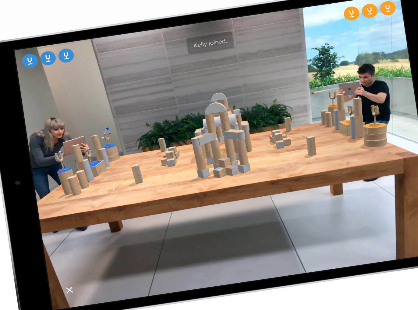
Image from Apple's website
The ARKit 2 game Apple will release on the App Store.
They also showed off a new app they're calling Measure, which can automatically detect and measure the size of real 3D objects, essentially turning your phone into a quick metre tape!
Screen Time and Notifications
Apple is introducing a suite of features that help iOS users track, control and limit the time they spend on their devices and on particular apps, called Screen Time.
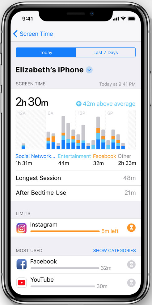
Image from Apple's website
Using Screen Time to track app usage.
The new system will allow users to set daily limitations on particular apps and they will be notified 5 minutes before their time ends and stopped from using the app when it does end.
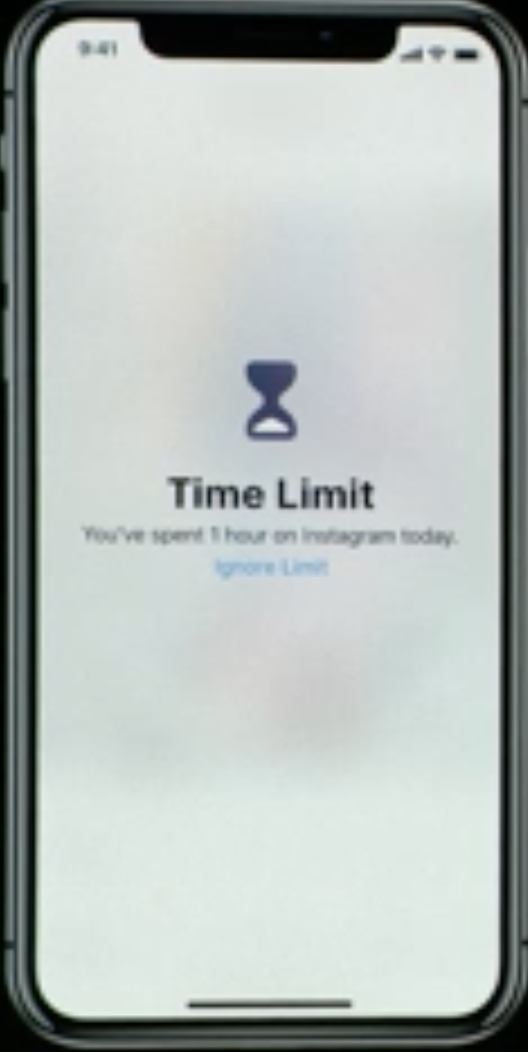
Image from WWDC 2018 Keynote
Once the time limit is reached on an app, the user is presented with this.
Along with that, they're introducting Do Not Disturb during Bedtime, which displays a darkened empty lock screen feed for users prior to going to sleep, and should they wake up to check their phone. This should help users focus more on getting a good night's sleep and have less distractions before bedtime.
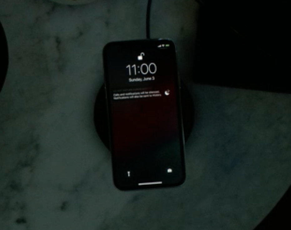
Image from WWDC 2018 Keynote
Do Not Disturb during Bedtime.
Finally, they're bringing grouped notifications; a feature that is long overdue on iOS! This will group notifications by app on the lock screen resulting in a much more organised notification experience. Additionally, they're letting users be able to customise their notfication settings for a particular app right from an app's notification; very much looking forward to this!
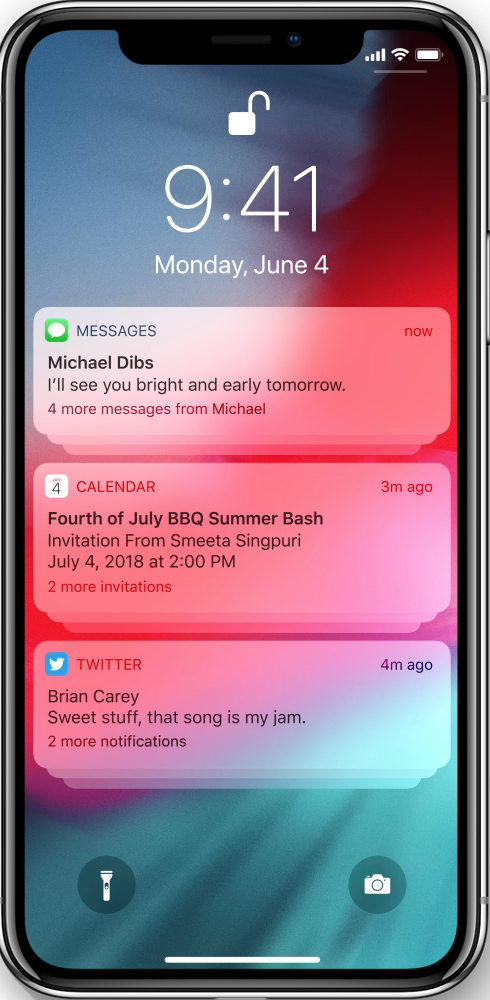
Image from Apple's website
Grouped notifications.
Shortcuts and Siri
This is one of the features I am most excited about for iOS 12! The new Shortcuts app will let users teach Siri to do a whole bunch of grouped actions and then trigger the actions with a single Siri command. This could, for instance, be when leaving in the morning for work, you would be able to simply tell Siri "leaving now for work", and Siri would get you a traffic report and best route to work, order your coffee from a nearby coffee shop, turn on the radio on your phone and dim the lights and turn off the heating in your flat through HomeKit.
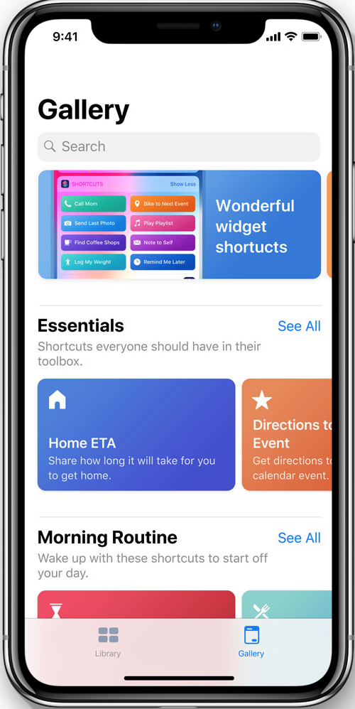
Image from Apple's website
The new Shortcuts app.
Shortcuts can also appear as notifications on the lock so they're accessible with one tap to run the tasks. The shortcuts that appear to you are determined using Apple's Siri learning technology which has been out there for a few years now and is fairly reliable and secure, as all learning is done on the device.
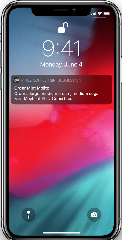
Image from Apple's website
Shortcut suggestions in notifications.
With that, you will also be able to tell Siri to do a certain action when you say a certain thing. For instance, you can teach Siri to order your coffee when you say "order my regular from Starbucks".
I am very much looking forward to be able to use this in a few months!
Updates to Animoji, Memoji and Group FaceTime
And on to the silliest update announced; iOS 12 will be bringing new Animojis along with tongue detection. Everyone will now be able to show off their tongues using their favourite Animojis along with a handful of new ones, like the T.rex! This was a particularly funny part of the keynote.
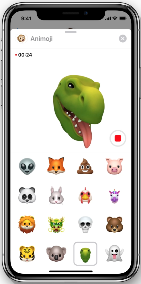
Image from Apple's website
The T.rex Animoji.
Additionally, they're bringing Memoji which allows users to create their own customisable Animoji to use anywhere they can currently use Animoji.
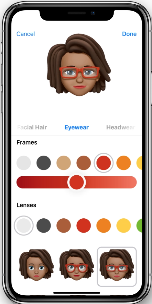
Image from Apple's website
Customisable Memoji!
Group FaceTime is also now a thing! Users can now FaceTime with up to 31 other friends at the same time. And this also brings the new Animoji in by having users appear as an Animoji, or their Memoji, in the FaceTime call.

Image from Apple's website
Group FaceTime.
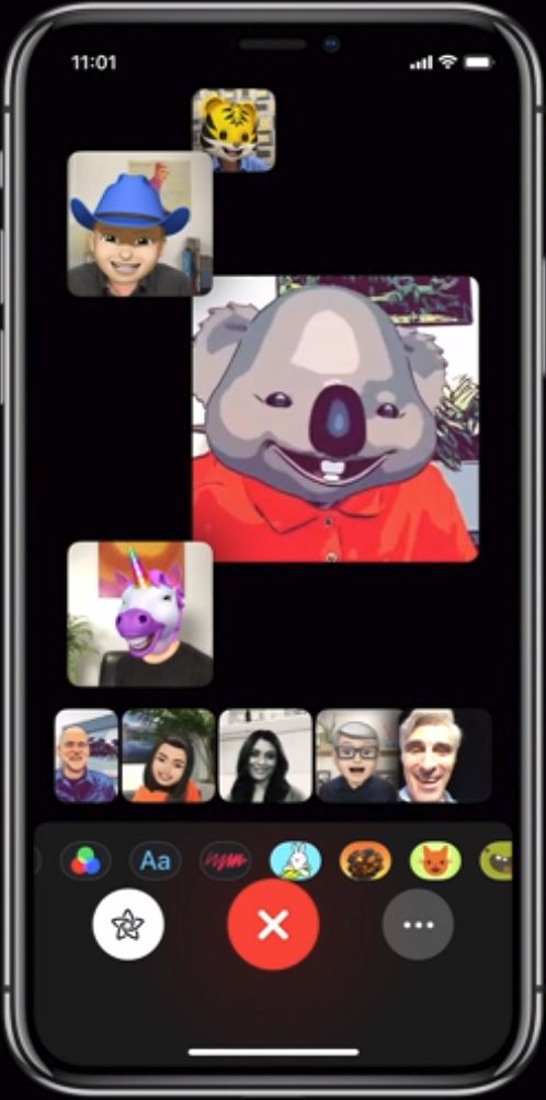
Image from WWDC 2018 Keynote
Group FaceTime with Animoji and Memoji!
Of course, Animoji is only available to iPhone X users, so for most of us, this is not really big news.
Everything else
Photos
Photos is getting an update that introduces a new For You tab which gives you personalised photo picks. This acts kind of like the For You tab in Apple Music. You will also get new sharing suggestions which suggest sharing photos with friends using facial detection. In addition, when the photos are shared with friends, they will be prompted to share their photos from the event you all attended with you. There's also a new smarter search that shows users suggestions before they start searching as well as give them the ability to refine searches.
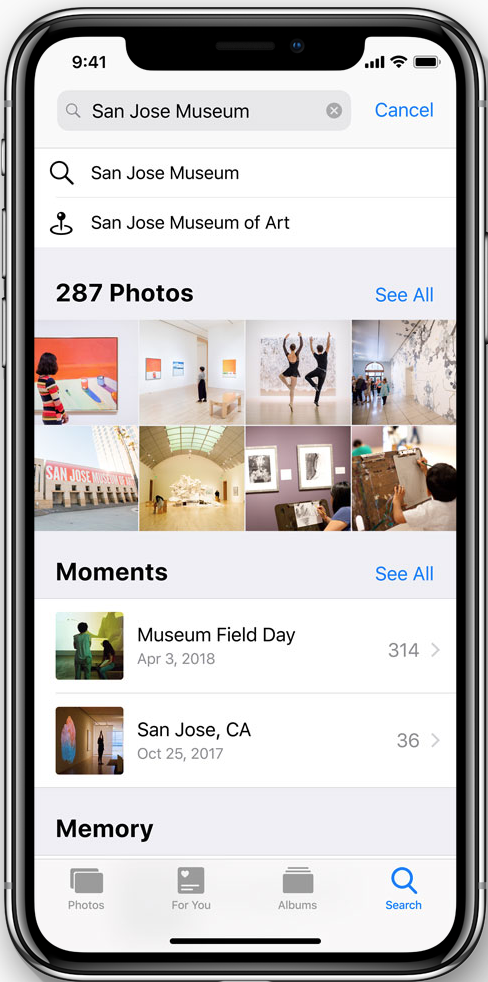
Image from Apple's website
Advanced search in Photos.
Carplay Navigation
Navigation using Carplay, which is Apple's car interface, is no longer limited to Apple Maps but can now also be used with Google Maps, Waze and other third-party navigation apps.
Revamped Apps
Four apps getting notable updates are News, Stocks, Voice Memos and Apple Books (renamed from iBooks). News is simply getting a new browse tab. Stocks and Voice Memos are being completely reworked as well as brought over to the iPad. Voice Memos will now also have iCloud integration, which is long overdue. iBooks is being rebranded as Apple Books (I don't really understand the motive behind this renaming), and is getting a fresh new design.
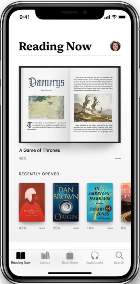
Image from Apple's website
The new Apple Books app.
watchOS
Offftt! That iOS section was quite lengthy! We now move on to talking about the new operating system for the Apple Watch, watchOS 5, very briefly.
Competitions
Last year, Apple introduced functionality that allowed users to share their exercise activity with friends. They're now expanding that by introducing competitions, where you can challenge a friend to an Activity Competition over a period of time. I think this is pretty cool and can certainly be good for mutual motivation.
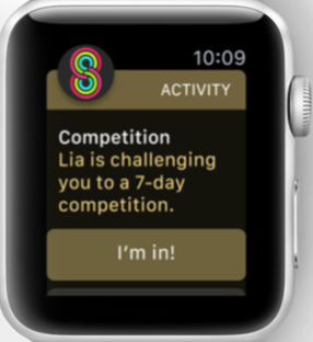
Image from Apple's website
Activity Competitions.
Walkie-Talkie
Apple introduced a new Walkie-Talkie app to the Watch that will let users talk to a friend nearby in true walkie-talkie fashion. By holding down a button, you speak, and then let go to listen.
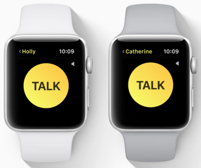
Image from Apple's website
The new Walkie-Talkie Watch app.
Everything else
Siri
Siri on the Watch is getting smarter. And it's no longer required to say "Hey Siri" to activate it, but rather a user can simply raise their wrist and give it a command.
Podcasts
A new Podcasts app is now available on the Watch. I actually never realised that there wasn't one already!
Notifications
Like iOS 12, watchOS brings a revamp to notifications bringing grouped notifications, quick response to notifications and more.
Student IDs
This is rolling out in only a handful of universities in the US with more to come. Students with an Apple Watch will be able to store their student IDs onto their Watch, or iPhone and then use it anywhere they would use a student ID, e.g. accessing libraries, labs, etc. I'm just hoping this comes to Glasgow before I graduate in two years!
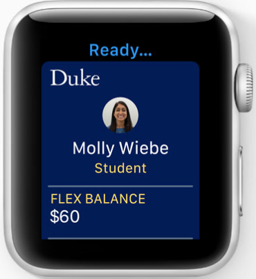
Image from Apple's website
Student ID cards on the Watch.
You can find out more about the new watchOS on Apple's website.
tvOS
tvOS is the operating system that the Apple TV 4K runs. It's getting a couple of new improvements in video and audio that are mainly quality of life changes.
4K HDR
tvOS 12 bring High Dynamic Range to the Apple TV, which means better colour for everything you watch on the Apple TV.

Image from Apple's Website
4K vs. 4K HDR.
Dolby Atmos
If you happen to have a Dolby Atmos-compatible sound system, then brilliant! Your Apple TV can now deliver even better sound.
Personally, I'm quite happy the Apple TV is getting a wee boost, as I've been thinking about getting one for myself soon. You can learn more about the new tvOS 12 here.
macOS
Now for the Mac! There's a whole bunch of new features here that I'm really looking forward to. So let's get started right away!
Name
Apple has been using a naming scheme for their macOS versions for 5 years now, which is to name them after places in California. This year is no different and macOS 10.14 is dubbed Mojave. Mojave is a desert in California which, according to Apple, has some lovely views, especially at night, which hooks into one of the main new features in the new version.
Dark Mode and Dynamic Desktop
Apple currently has a dark theme for its operating system which really doesn't go far beyond the dock and the toolbar. No windows or apps are affected when turning on the dark theme; until now!
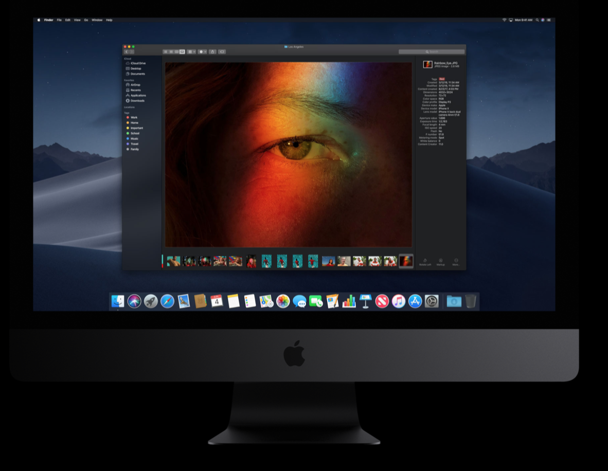
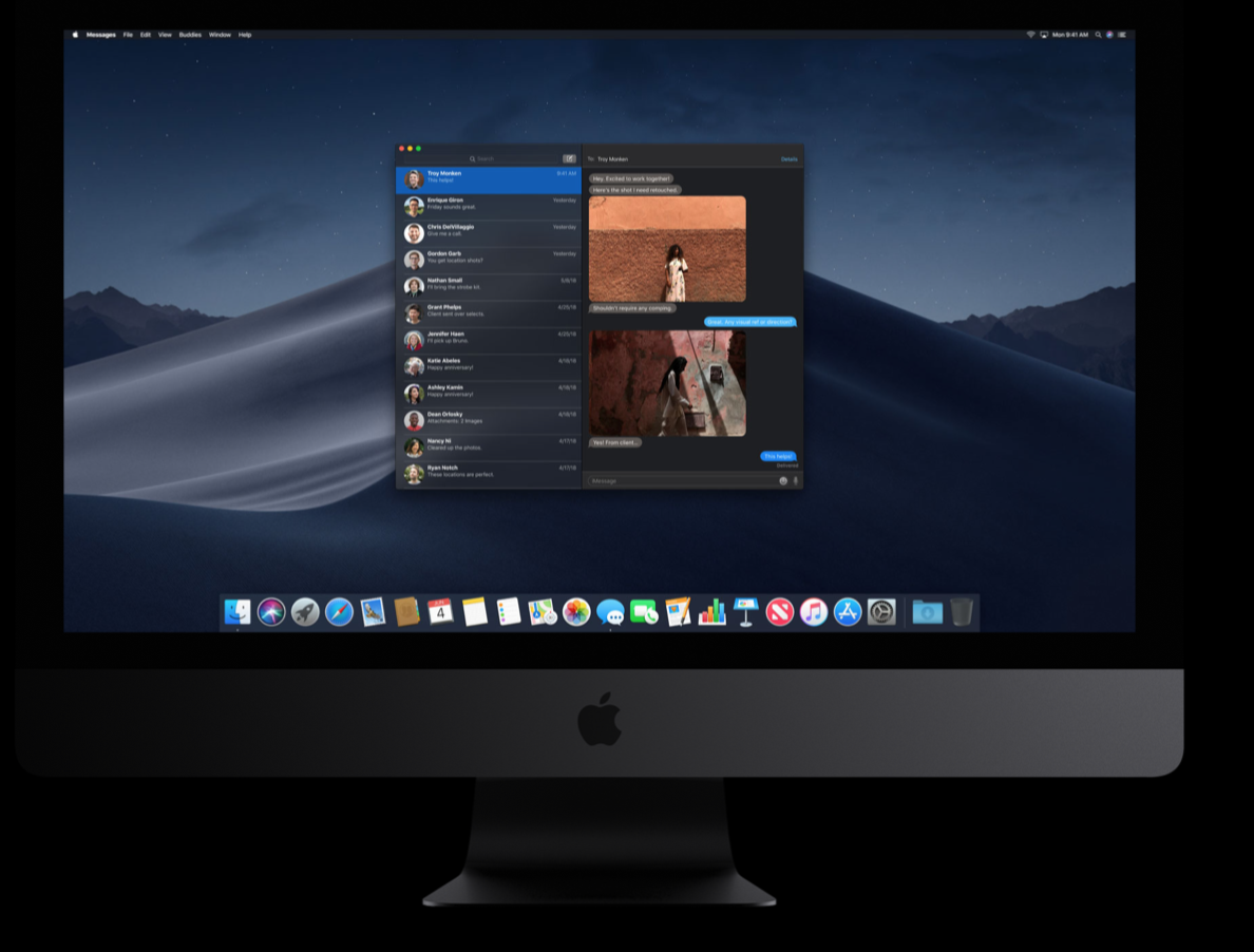
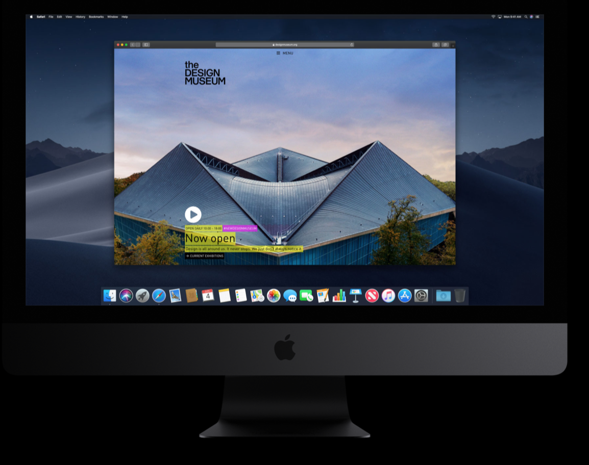
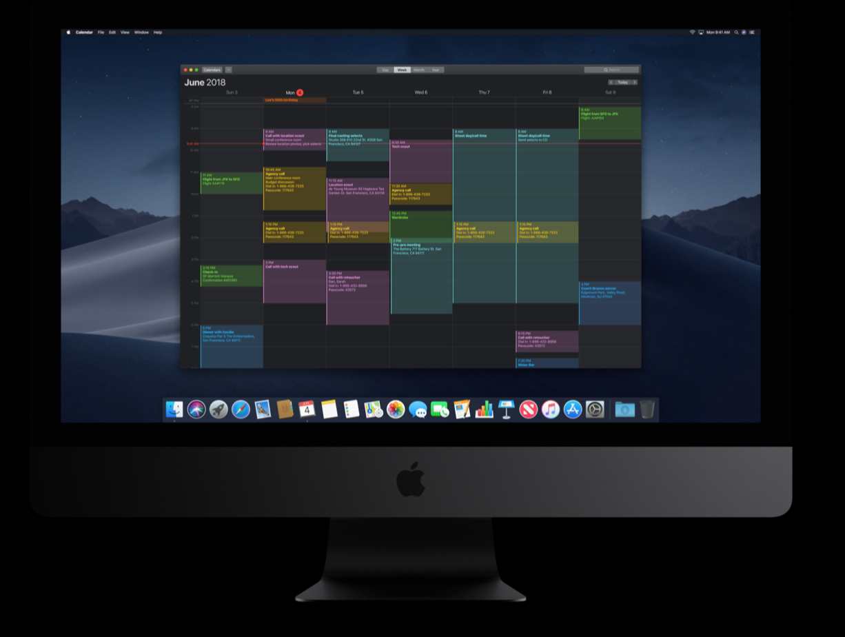
Apple is bringing a new Dark Mode that permeates the entire system and includes all windows. Developers do have to do some minor optimisation for their apps to look good on Dark Mode but all Apple apps will look brilliant out of the box with this. This is really best described by images, check out these excerpts from the Apple website:
Images from Apple's website
But the app where changes will really be most impactful to me as an Apple Developer is Xcode; and Dark Mode Xcode just looks gorgeous:
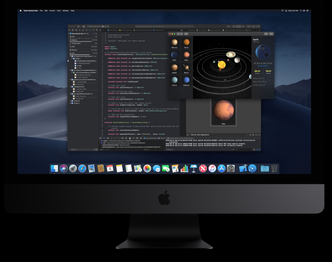
Image from Apple's website
Dark Mode Xcode.
Personally, I currently use the normal old dark theme, so I'm definitely looking forward to joining and embracing the true dark side, when Mojave launches!
In addition to Dark Mode, Apple also introduced a new Dynamic Desktop wallpaper, where shades on the wallpaper change throughout the day. This really shines with the new Mojave wallpaper; the one of the desert. The best way to really appreciate this is to see the animation on Apple's site.
Desktop Stacks
Stacks is another feature for the desktop. If a user has many files, of many types, on their desktop, then with a simple click of a button accessed through the toolbar, the desktop is neatly tidied with files grouped together into stacks according to their type. This is a small quality of life improvement, which I actually think could be really good.
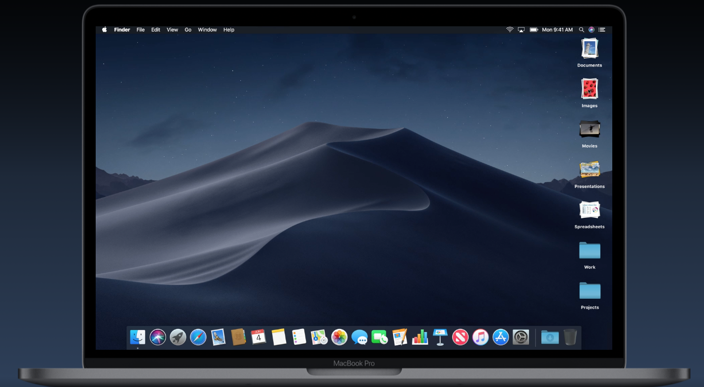
Image from Apple's website
Stack on the desktop.
Improvements to Finder
The Finder as well recieves some neat quality of life improvements, with a new gallery view for files, quick actions and full metadata on the right hand side bar, along with improvements to quick look. I think the new gallery view looks quite good and the quick actions will definitely be handy.
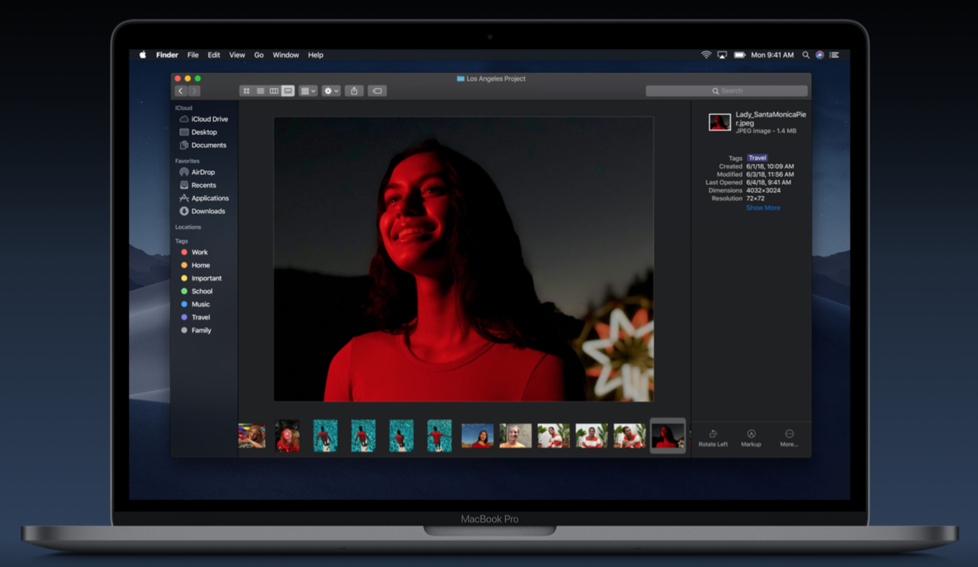
Image from Apple's website
The new gallery view. There's also now quick actions that depend on the selected file's type on the bottom right, as well as full metadata being displayed.
Quick Look, which lets users preview files without using an app to open them by hiting the spacebar (this is actually a really great feature in macOS), gets some love as well. There's now a new bar at the top that lets users work on files while previewing them; adding features like Mark up, cropping and rotating images, etc. This will actually come in pretty handy when I need to do some quick image edits.
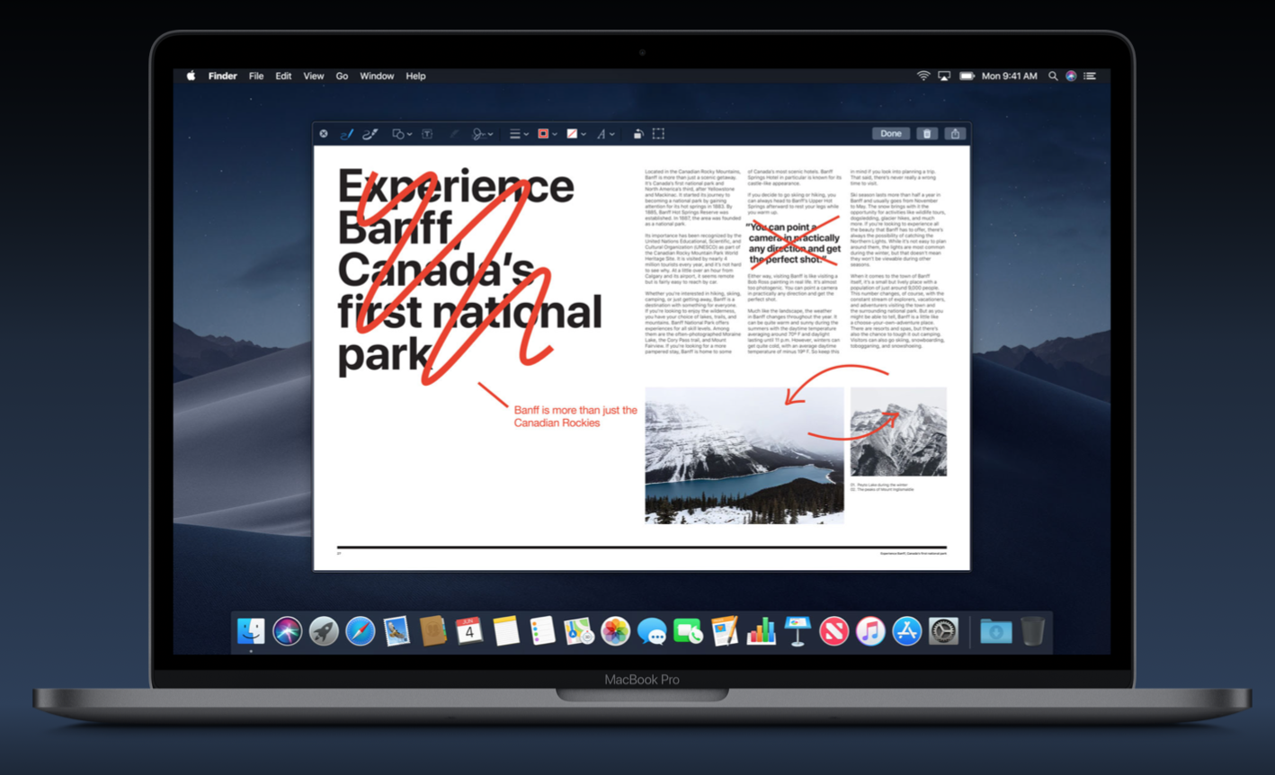
Image from Apple's website
New Quick Look with a bar for editing files.
Screenshots
Screenshots, which were previously limited on macOS to just being able to either take a photo of the entire screen or make a selection of the screen to screenshot and having the photo saved to the desktop, get a few improvements with Mojave. The changes being made bring features that were introduced to iOS with iOS 11 to the Mac, and it's a really welcome change!
First off, users can now pick a location for screenshots to be saved in. In addition when you take a screenshot, it moves to the right hand corner of the screen and persists there for a few moments, much like it does with iOS 11. You are able to drag the screenshot into anywhere that can accept an image. Otherwise, it disappears and saves into your preferred location.
Additionally, there's screen recording built in now! It shares a similar interface as screenshots and you can choose to either record the entire screen or just a selection. You also get all the works; being able to set a start timer, showing the cursor or not, etc.
As someone who takes plenty of screenshots, on a daily basis, and who often finds himself with plenty of screenshots cluttering their desktop, I very much welcome this change!
Continuity Camera
Continuity was a feature introduced a few years ago that let users start tasks on a device, and pick it up seamlessly on another device. It's a brilliant feature that I find myself constantly using.
Continuity Camera lets Mac users ask to take a photo on their iPhone nearby, and have it appear right on the Mac ready for use.
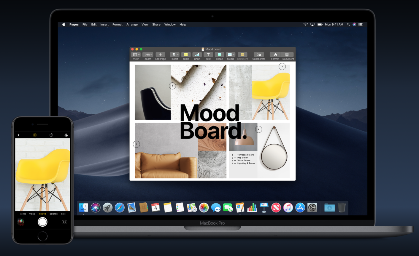
Image from Apple's website
Using Continuity Camera in to take a photo on an iPhone and have it appear in Keynote.
Everything else
FaceTime
Just like on iOS, FaceTime on the Mac now supports group video chats with up to 32 people.
New Apps
This is actually quite notable because there's been plenty of chatter over the past few years about the possibility of Apple merging iOS and macOS. Apple gave a firm NO to this idea today saying that the Mac has its own feel given the hardware it has access to, the keyboard and the trackpad as well as everything else that seperates it from the mobile device category. That being said, they are bringing four apps over from iOS; News, Stocks, Home and Voice Memos. Three of those are ones which recieved updates/reworks on iOS. Additionally, they are working on an unnamed technology that allows iOS developers to optimise and run their iOS apps on the Mac. It does this by bringing over some elements of UIKit, the platform that all iOS apps use to really show any kind of UI to the user, to the Mac. This is not being made available right away and Apple is still testing it out. According to Apple, those four apps were brought over to the Mac using this new technology. They are planning to have this out for developers to use in 2019.
New App Store
The Mac App Store gets a fresh new look that is similar to the update the iOS App Store recieved last year with iOS 11. There's now new tabs for Discover, Create, Work, Play and more. Another welcome quality of life change, as the App Store was starting to feel a bit dull lately!
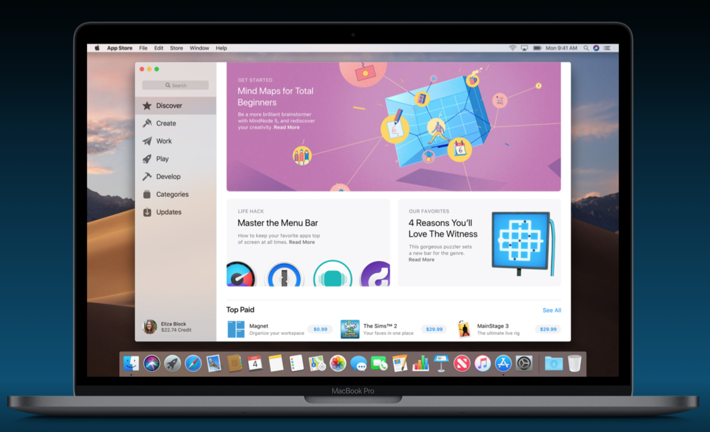
Image from Apple's website
The new Mac App Store.
Privacy
There's a bunch of new privacy features including having apps require asking for permission when trying to access camera, microphone, contacts, calendar, etc. In addition, Safari now has better ad tracking prevention which works by only sharing a simple system profile that makes your device indistinguishable from any other device. That, and plus it will now require social Like and Share widgets and comment widgets to ask for permission before they are used.
The Bit at the End
After Craig finished talking about the new macOS, Tim got back on stage and wrapped up the keynote by giving a brief summary of everything announced and then another video about developers started playing, this one focusing more on apps being developed and showcasing a few app development stories.
This was a bit of a surprise, as we usually get treated to just the one developer video. This one, titled Source Code, however was quite cool, and in the usual Apple way, fairly heartwarming. You can check out the video for yourself here.
Conclusions
Like every year, this WWDC's keynote was a joy to watch, for me at least. There's plenty of features in the new iterations of iOS and macOS that I'm definitely looking forward to. Most notable are Siri Shortcuts and being able to teach Siri commands, Dark Mode in macOS, notification improvements in iOS, as well as the new Screen Time feature.
There were a lot more demos and stuff discussed in the keynote than I covered here. Feel free to give it a watch yourself!
Closing Remakrs
I hope you enjoyed this post! This is the first time I write an article of this sort; a report on an event. So I would appreciate any feedback on the style of it and how engaging it was. Many thanks for reading!
